If you’ve ever spent any time at Dribbble, you know how much designers love to customize UIPageControl, normally in the form of custom spacing or fancy inset looking page dots. As a developer, you’re probably also keenly aware of the lack of customization that Apple’s built in class provides. Hell, it wasn’t even until the introduction of iOS 6 that you could change the tint color, and even then, that’s where the flexibility ends.
Given my blogging absence in recent months, and the fact that I have a somewhat immediate need for a highly customizable page control, it seemed like a fun opportunity to spend an afternoon making something I could share. Admittedly, this isn’t a terribly hard problem to solve – UIPageControl is one of the least sophisticated bit of UI in iOS. Despite this being an open-source softball, I was excited by the idea of writing something simple, yet robust enough that I wouldn’t have to tackle this issue ever again.
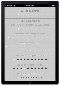
SMPageControl provides all the functionality of UIPageControl, but also adds the ability to change indicator diameters, margins and alignment. It also provides support for using images as the inactive and active page indicator. For greater control, it is also possible to provide index specific indicator images.
If you’re not interested in the fanfare and hot air about to follow, go ahead and just grab the code from GitHub.
Update: Two new features have been added. A masking mode that will allow indicators to use the tint coloring, along with an image as a clipping mask. And a convenience method for updating the current page by passing in a scrollview.
Find and Replace
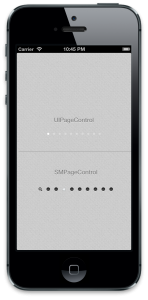
Using this class is as simple as they come, you can quite literally just change your class names from UIPageControl to SMPageControl, and SMPageControl will seamlessly provide all of the bland, out of the box functionality you are used to. It also provides the same two (and more) UIAppearance properties, pageIndicatorTintColor and pageIndicatorTintColor. I’ve made an effort to precisely mirror the default functionality, so that UIPageControl can be used as normal, while being able to make a quick shift to SMPageControl as soon as extra flexibility is required.
Example:
// Positioning code suppressed
UIPageControl *pageControl = [[UIPageControl alloc] init];
pageControl.numberOfPages = 10;
[pageControl sizeToFit];
[self.view addSubview:pageControl];

SMPageControl *pageControl2 = [[SMPageControl alloc] init];
pageControl2.numberOfPages = 10;
[pageControl2 sizeToFit];
[self.view addSubview:pageControl2];
A Little Bit Retro, a Little Bit Rock and roll
SMPageControl allows for the tried and true page control appearance, with some slightly adjusted layout. Using the fully UIAppearance compatible properties, indicatorDiameter and indicatorMargin, it’s easy to make SMPageControl appear a bit more modern.
// All instances of SMPageControl across the app will inherit this style
SMPageControl *appearance = [SMPageControl appearance];
appearance.indicatorDiameter = 10.0f;
appearance.indicatorMargin = 20.0f;
Alright, so bigger, more whitespace; that’s hardly Dribbble worthy, right? Well fortunately, SMPageControl has two more powerful properties – Also UIAppearance compatible – pageIndicatorImage and currentPageIndicatorImage. These are probably my favorite two properties, as they allow for a wholesale replacement of the active and inactive “dots”, with two quick and easy lines of code.
// All instances of SMPageControl across the app will inherit this style
SMPageControl *appearance = [SMPageControl appearance];
appearance.pageIndicatorImage = [UIImage imageNamed:@"pageDot"];
appearance.currentPageIndicatorImage = [UIImage imageNamed:@"currentPageDot"];
Stand Out In A Crowd
The final bit of customization provided by SMPageControl is its support for per-indicator images, a function that really is the icing of its flexibility. The easiest example of this to point out is the all too familiar Springboard. Ever since Spotlight was added in iPhone OS 3.0, the springboard page control has included a little search icon along with those classic circles. SMPageControl makes this sort of customization trivial. Because of the case by case nature of how I expect this feature to be implemented, per-indicator images are not compatible with UIAppearance – but adding them is just as quick and easy.
SMPageControl *pageControl = [[SMPageControl alloc] init];
pageControl.numberOfPages = 10;
[pageControl setImage:[UIImage imageNamed:@"searchDot"] forPage:0];
[pageControl setCurrentImage:[UIImage imageNamed:@"currentSearchDot"] forPage:0];
[pageControl setImage:[UIImage imageNamed:@"appleDot"] forPage:3];
[pageControl setCurrentImage:[UIImage imageNamed:@"currentAppleDot"] forPage:3];
[pageControl sizeToFit];
Feedback and Suggestions Welcome
I suspect that for a problem with such a narrow set of requirements, there isn’t much left that this little project doesn’t cover. That seems to be further supported by the similar feature set of this project and the others I’ve found. (P.S. It’s generally best to do the diligent Googling before writing your own new code to solve solved problems – whoops). However, I already mentioned that I wanted this to be robust enough that I wouldn’t have to chase a similar solution ever again. If there’s something I’ve missed, fill out the comment box just below.
If you’ve read this far, I’m impressed – and it’s probably time you just went and grabbed the code for a bit of tinkering.
Tweet


